Victor Chia Director of User Interface Design
Web typography trends
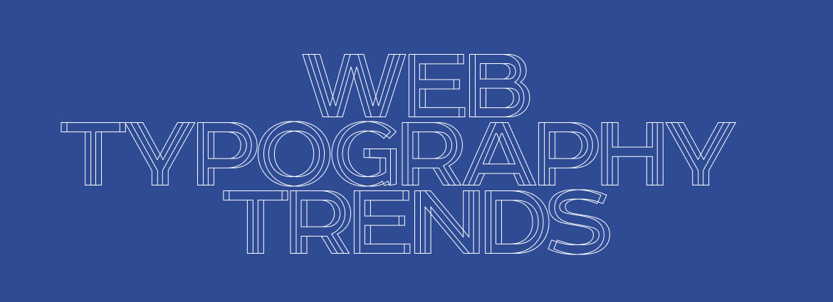


As designers, we rely on typography now more than ever for storytelling in design, and with more access to tools and innovative typefaces, you can create just about anything you can imagine. Let’s take a look at a few typography trends you should know for 2020.
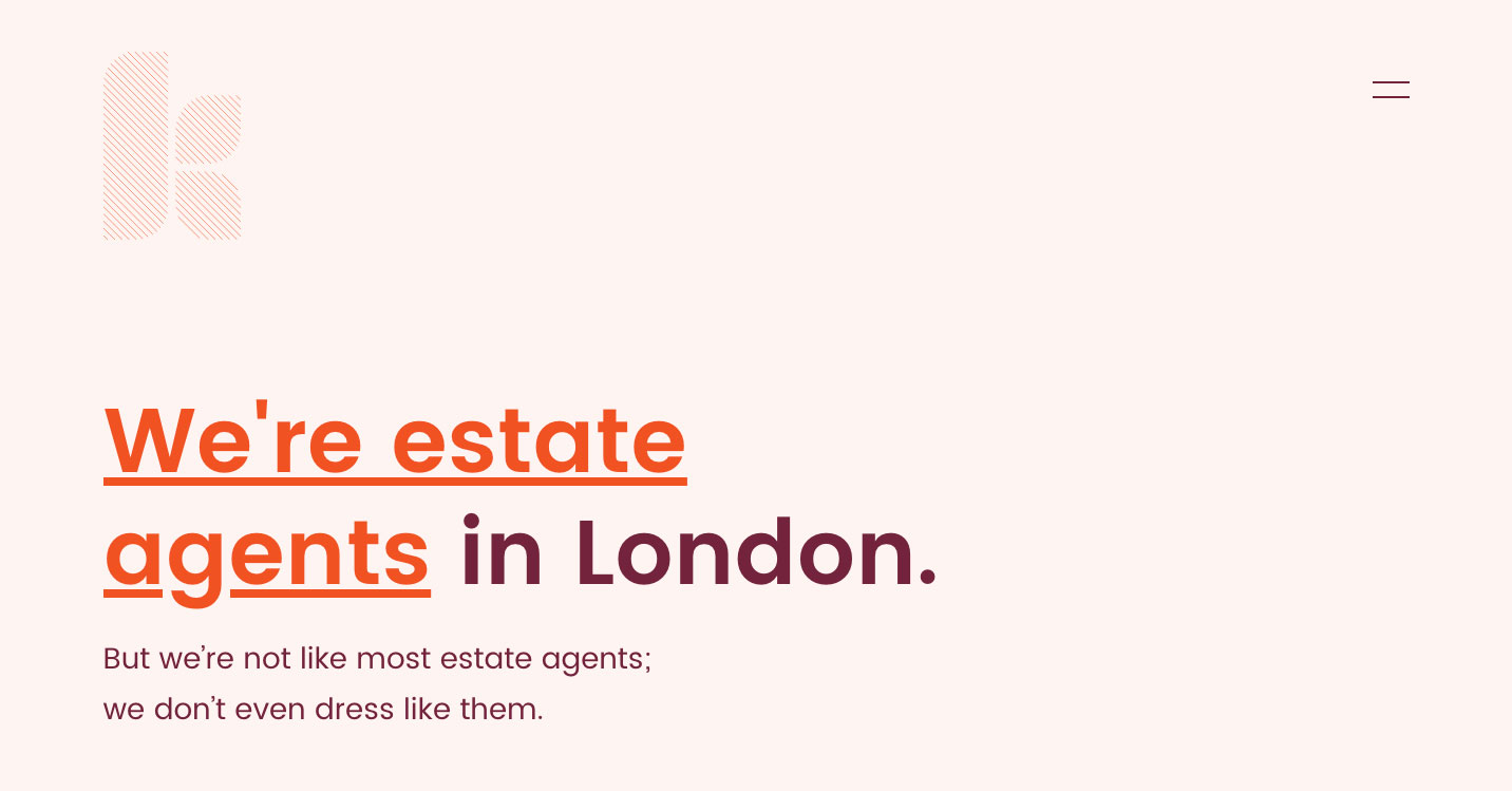
TEXT ONLY HEROES
The hero image or “above the fold” area is often the first visual element a visitor encounters on the site; it presents an overview of the site’s most important content. While most hero areas have gotten more involved with different kinds of elements than just the standard text-on-image set up, recently we see many websites are shifting towards a less cluttered text-only approach. Keatons is a great example of stripping things back in the hero area, and focusing only on typography. You can also see this trend in the newly redesigned Wolff Olins website which has removed the typical background image and just letting typography do the work.
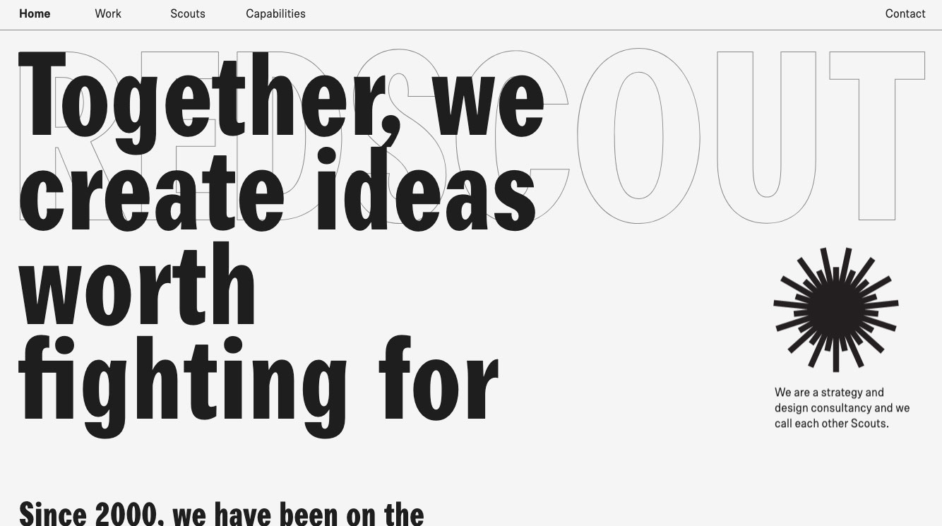
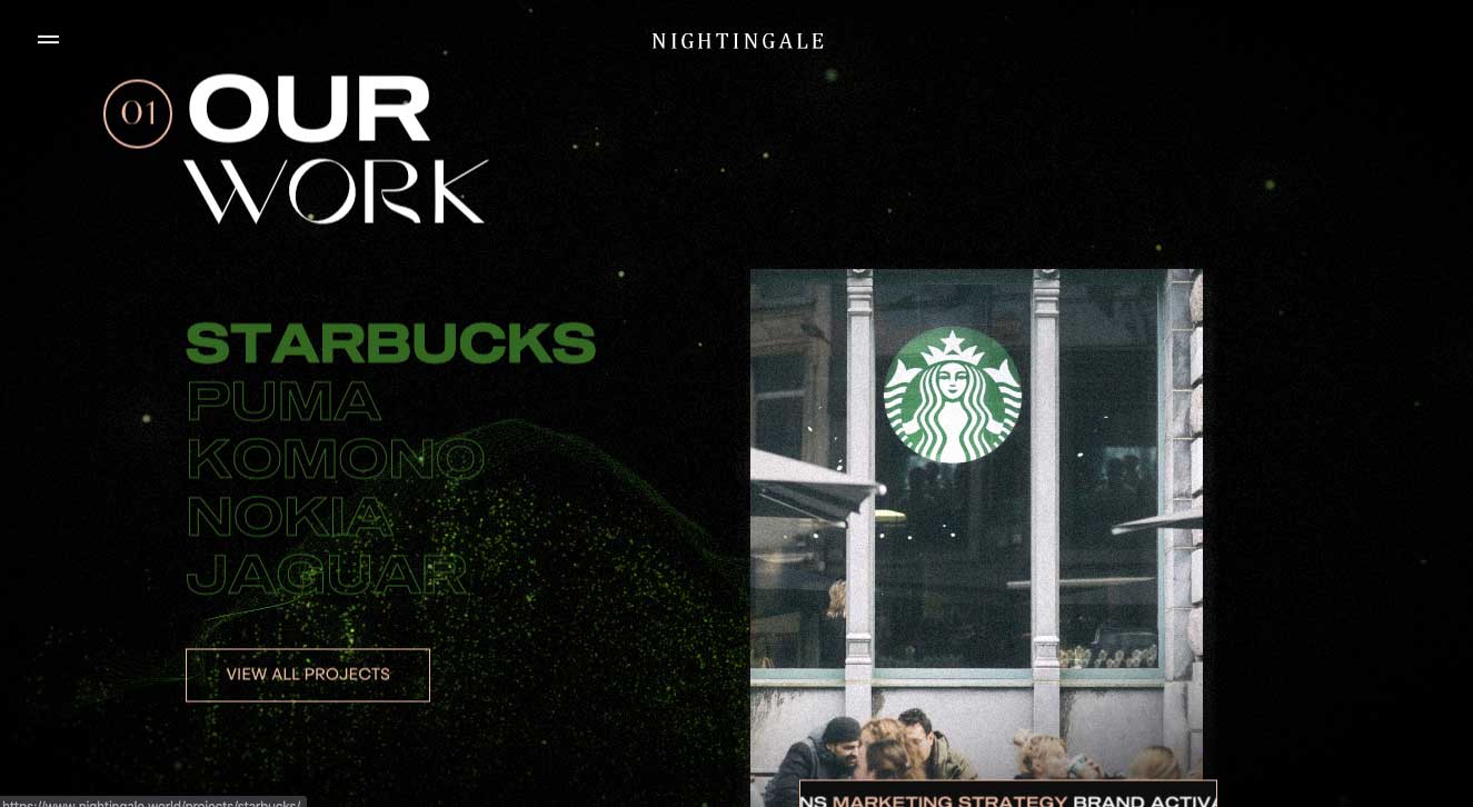
OUTLINED FONTS
No doubt typography on the web is getting bigger and bolder and more visually interesting. There’s almost no limit to how loud you can be when it comes to attention grabbing in a overcrowded internet environment. While solid typeface has been the obvious choice, we are starting to see outlined type has made an interesting transition into website design. Redscout features this outlined typography in a slightly reserved approach by creating a typographic background, while Nightingale incorporated this feature with their outlined call-to-action UI design.
HIGH CONTRAST SERIF TYPEFACE
Serif fonts, especially in print, have typically been viewed as traditional, classic, even old and sans serifs have been the go-to for web designers for their clarity and simplicity, the perfect modern typeface choice for text on digital screens. However, this has changed. And its transformation is a dramatic one and its variations are extreme.
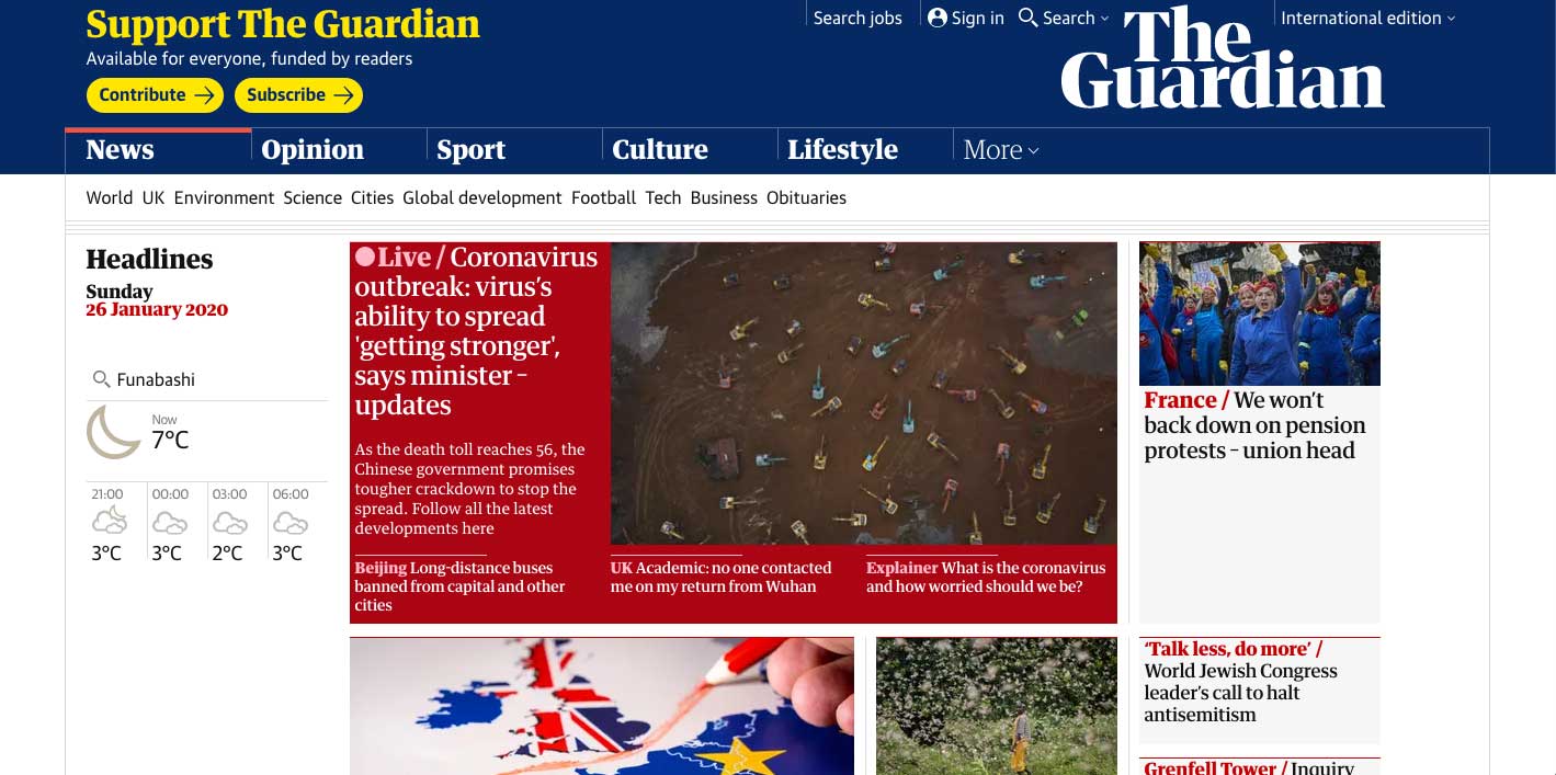
Serif fonts, especially the ones with high-contrast, have become one of the favorite choices in web design. Frequently seen in startups and editorial websites, the bold and pointy serif is now considered to be full of personality and edgy. The Guardian is probably one of the early adopters of this trend that successfully utilised modern serif fonts with proper spacing and thickness which perceived to be edgy and contemporary.
Appropriate font-pairing is essential when using high-contrast serif. Glasgow International uses a funky serif that works harmoniously together for providing ample contrast between lettering styles.
The evolution of typography is evolving more rapidly than it has ever been on the web as screen, font, and design technologies continue to advance. No matter how impressive the trends seem to be, typography trends should always maintain a high regard for readability and functionality.


