Victor Chia User Interface Design Director
Language selection for multilingual websites

In an increasingly connected world, multilingual websites are becoming more and more common. A website with international markets in mind has to reflect its international users’ needs and preferences as users expectations for good user interface and experience are high.
One of the most important parts of the multilingual design is user-friendly language navigation. A user needs to be able to easily find the “magical place” on the page that will allow them to switch to their preferred language without being forced to change the region or redirected to a new page.
So, how do we design and implement a language selector for a seamless experience? Let us look at two common strategies and best practices to consider when designing a language selector for multilingual websites.
1. Dedicated language buttons
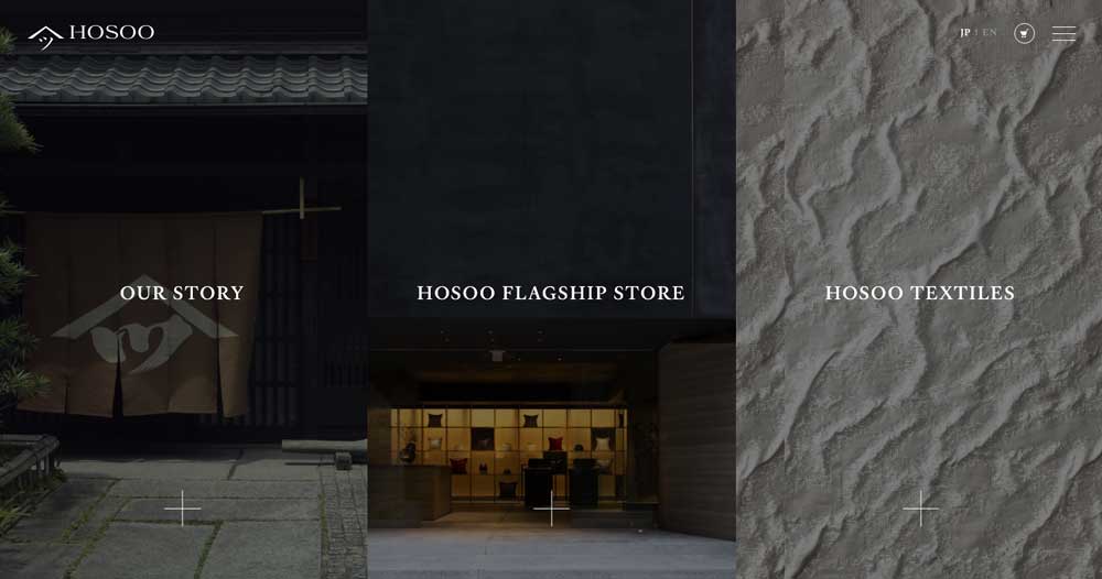
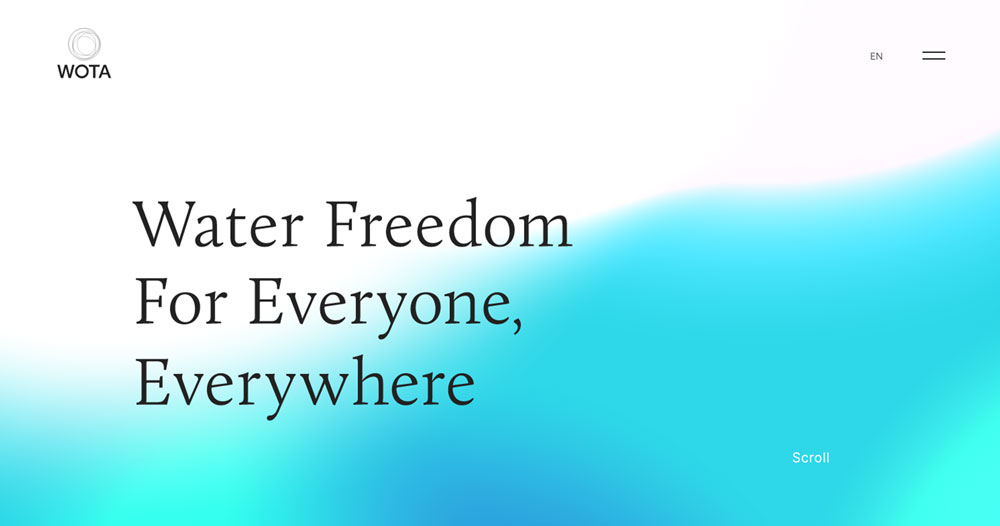
This is a simple language selection which enables users to quickly flip over to a localized version of the page. It is highly effective when you are targeting a very specific market. For example, if your main target audience is Japanese users but also would like to include an English speaking audience, you can include language buttons on your website’s navigation menu. This approach is highly popular in Japan especially with small or medium-sized enterprises. Hosoo and WOTA are examples of this, offering users the option to instantly translate the web page into English. The biggest design challenge with this option is space. Any more than two languages and it’ll quickly make a website navigation look cluttered and confusing. On the other hand these buttons shouldn’t be hidden as you want to minimize clicks for users.
2. Selection menus
Selection menus work well when you have a lot of languages to deal with. The easiest option to design and implement would be a simple drop-down menu. It’s a button or icon that, when clicked, reveals a list of languages that users can scroll through and select from. You will commonly see them on the top header or footer of the page.
As simple as it sounds, there are some options to consider for the best implementation based on the website’s needs. For example, how will you organize the menu and represent each language? Will you list languages only, or list countries multiple times for different languages? This option is perfect for businesses whose services vary from market to market since it redirects users to country-specific pages with unique experiences that are relevant to particular countries.
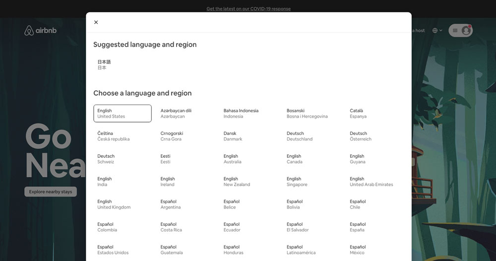
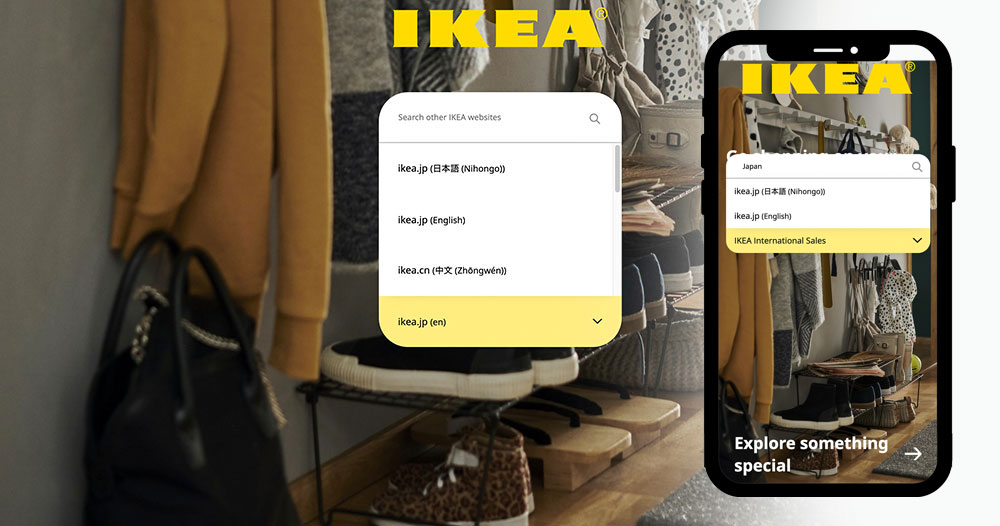
Airbnb’s region page did an excellent job by offering an extensive list of countries, regions and currency, helping users comfortably find relevant content. Another example of good language selection design is IKEA‘s global shop page. Its simple dropdown menu includes an instant search result function that provides users a more seamless experience, especially on mobile.
Website language selector best practices
Here are a few guidelines that we often adhere to when designing multilingual websites for our clients:
1. Automation is great to have, but you want visitors to have the option to tailor their experience.
2. Always use the local format and spelling of the language. It needs to be recognizable instantly to native speakers. For example, Japanese should be listed as 日本語.
3. Make it easy to find. You don’t want to end up frustrating visitors.
4. Avoid using flags. They were never designed to represent languages unless content is specifically tailored to that individual country. Flags Are Not Languages blog and Neilsen Norman Group provide a much deeper insight to this matter if you’d like to learn more.
5. Use a universal symbol for a language switcher icon e.g. a globe
A well-designed language selection process is a key component of a multilingual website. Designers can either create an accessible UIs that empower their users or hinder them.
Designing a language switcher can be a complex task but that doesn’t mean you can’t get creative. There are some great designs and implementations out there, and this challenge requires some unique innovation if you’re trying to develop the best user experience.


