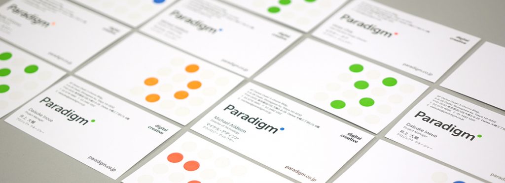
Today we introduce the new Paradigm brand identity.
Rebranding a creative agency is never a trivial undertaking. In fact, in 25 years of business this is just the third version of the Paradigm brand.
The main reason behind creating this new identity is to more clearly communicate the key areas of business that we now operate in.
Although the origins of the business — like most others in 1992 — were in print, we have evolved to become one of Tokyo’s leading full-service digital creative agencies. We wanted to brand ourselves in a way that reflected that.
About the new identity
The new logo is simple, bold, bright and forward-looking. The word mark has more impact and is more legible (for typographic otaku it is a customized version of Museo Sans).
The previous collection of dots has been reduced to a single one, brightly colored, that sits to the side of the name Paradigm.
This dot can be one of seven bright colors, and is reproduced in special fluorescent ink on our new business cards (staff can choose a color that reflects their personal taste).
Dots, in some form, have always been part of the Paradigm identity. In the first instance (1992) they were a series of dots that created a large circle through the letter ‘i’ in the company name. In the second version (2001), they formed a sort of beehive tightly gathered again around the letter ‘i’.
Although the master logo has been simplified, these days identities are rarely static devices. They are often brought to life. You can see this on our new website. The dots come alive in a grid, animated with color and movement. This relates to much of what we produce — on screen, in a browser, ultimately in pixels.
This rebrand marks just the first step on this exciting new phase of the Paradigm journey. Please stay tuned for ongoing updates and news.
